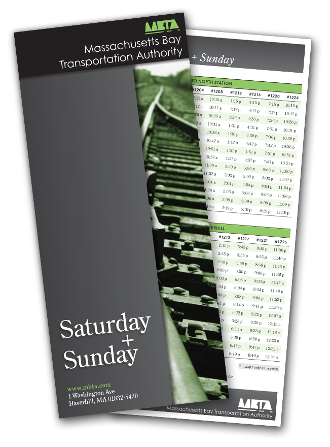
This was a fun project. In my beloved typography class, we were tasked with designing a train schedule using no design direction and a really rough Excel-looking document with nothing but the days (Saturday & Sunday), the schedule, and the holiday hours listed.
I think the point of not having any information on what kind of schedule it was and from whom, during the intitial concepting stage, was to keep us from being "inspired" by the MBTA website and designs.
It worked and I really like what I came up with.
I think the point of not having any information on what kind of schedule it was and from whom, during the intitial concepting stage, was to keep us from being "inspired" by the MBTA website and designs.
It worked and I really like what I came up with.
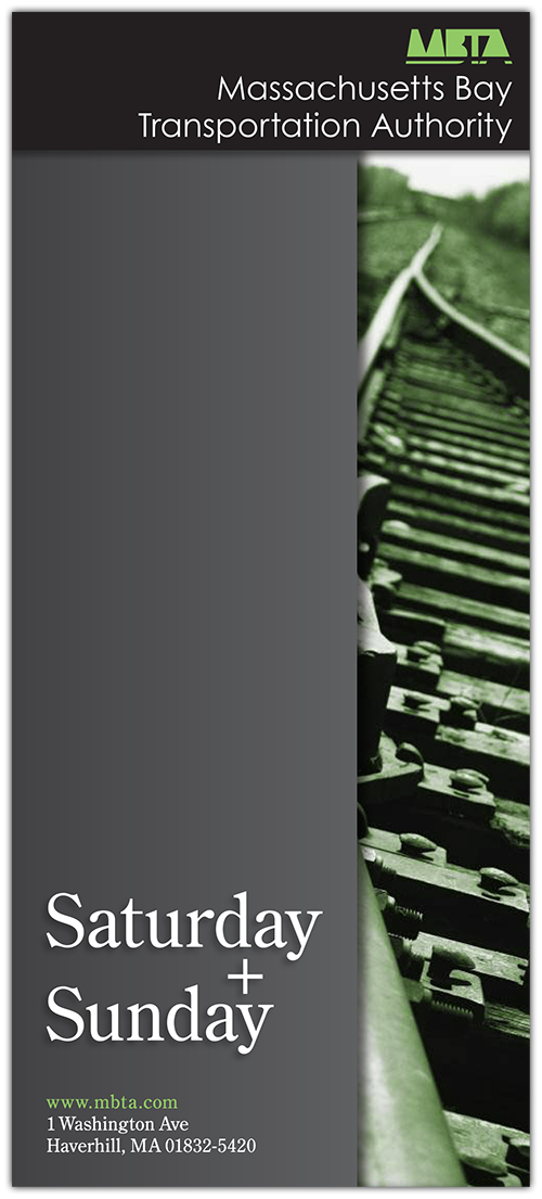
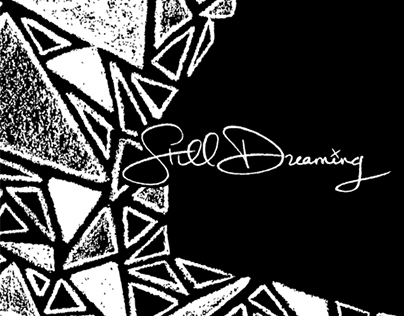
This would print on both sides, using a good, durable paper stock with a coated finish on the cover side and a matte finish on opposite side displaying the schedule.
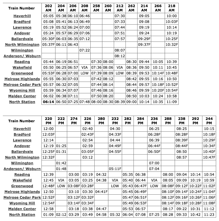
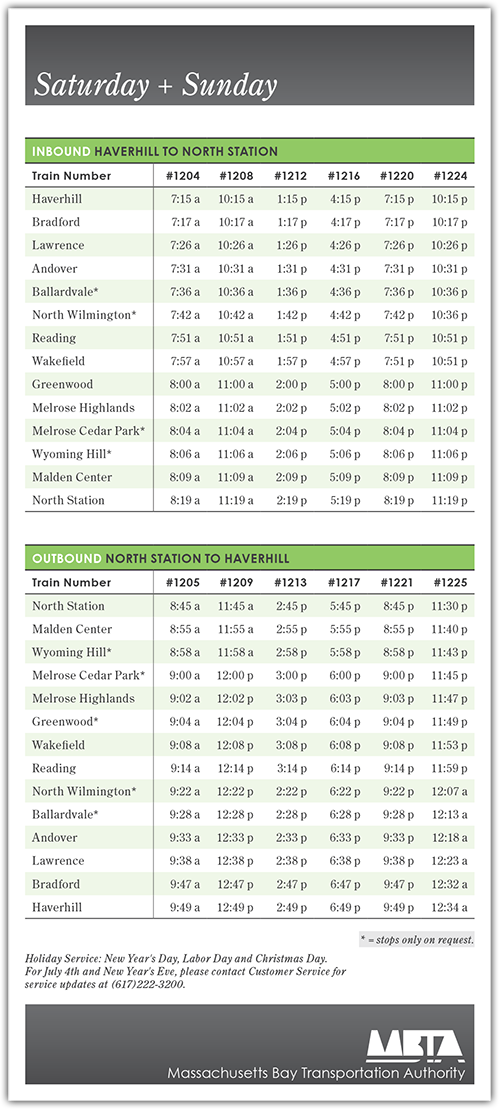
This isn't the exact document we were given in class, but this is a decent example. The one we recieved was in worse condition than this (from a design standpoint).
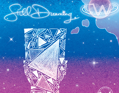
I transformed my project from the example above, to this...